Amy Wood is the Senior Director of Recruiting Operations at Gem and has spent the past 15 years in and around the recruiting space. She grew up through the ranks of agency and in-house GTM and Tech recruiting, has led Engineering and Product recruiting teams, built a Recruiting Ops team from the ground up, and most recently led an Employee Technology team at HubSpot that heavily supported Recruiting systems.
“Maybe stories are just data with a soul.” Brené Brown
Recruiting Ops professionals and talent leaders can take a page from Brené Brown. In our roles, we often focus a lot on the “what” when it comes to data, but for Talent Acquisition (TA) to drive change and be successful, we also need to deliver the “why” when it comes to decision-making and resource asks.
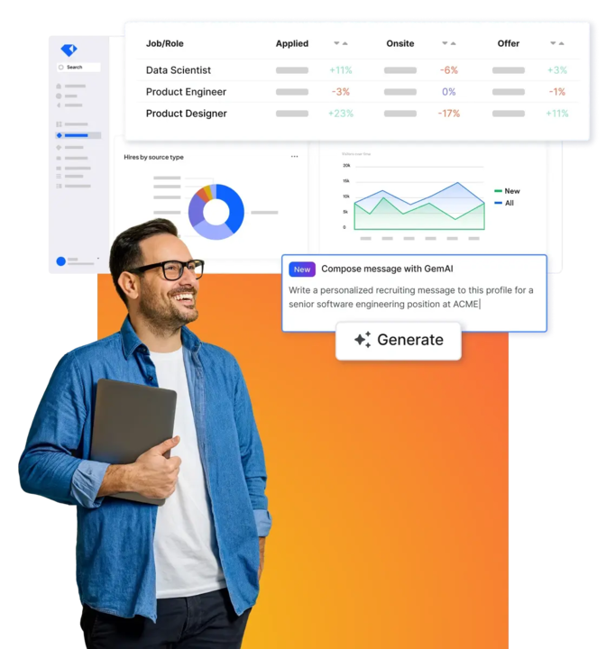
With the onset of modern-grade TA technology, Talent teams can finally bring data into the conversation when discussing talent acquisition strategy. This includes measuring recruiter performance, pipeline health, candidate source attribution, and closing strategies. But, the drive for data doesn’t start and end with recruiting teams. Often, the surrounding teams (Finance, Exec Leadership, HR, the Business) are equally as hungry for insights on how to grow their teams successfully.
You have the drive, the data, and an engaged audience. Now, how do you get your point across? As the recruiting analytics center of excellence, you have more context on the subject matter than anyone else. The last thing you want to do is confuse them.
As the recruiting analytics center of excellence, you have more context on the subject matter than anyone else. The last thing you want to do is confuse them
Early in my career as Recruiting Ops leader, I made the mistake of hosting a three-hour (I wish this were an exaggeration) Recruiting Leadership meeting to present our team’s data — ALL of our data. Did our audience walk away with the same insights and action items we had planned? No — they walked away bored.
I’ve since learned from this mistake (along with others!) and, with the input of colleagues and mentors, have built a framework for how to present data that can drive strategic decision-making effectively. I use this framework to coach my recruiting teams, so they facilitate productive conversations with their hiring managers and cross-functional stakeholders. And today, I’d love to share a snippet of that framework with you.
Context is king (or queen)
Say you need to roll out a new referral program. You need data that validates that the pilot program drove more qualified referrals into the funnel and reduced the need for passive hiring. But in your analysis, you choose to pull data from the last week of every quarter, when teams prioritize their focus on hitting department goals. Your analysis is likely to show that referrals are down. However, if you extended your analysis over a broader time period, you would have observed that the referral program is your company's most effective source of hire. This simple example illustrates a key point: context is important. If you look at your data in a vacuum, the best case is it will appear pretty useless, and the worst case is that you are presenting it incorrectly.
Here’s a simple checklist I suggest to my teams when running an analysis:
Eliminate confounding variables by comparing across different timespans, different teams, and different recruiters
Tap into external market data to benchmark your metrics
Add qualitative color to your quantitative insights by talking to your team, hiring managers, candidates, etc. about what they’re observing and why
Here’s another example that illustrates the marketable difference between these two representations of the same data set:
We hired 200 people year-to-date
We hired 200 people last quarter, which is 10% more than the same time last year
Take a guess at which one provides more context. Do more of that.
Structure your story to your audience
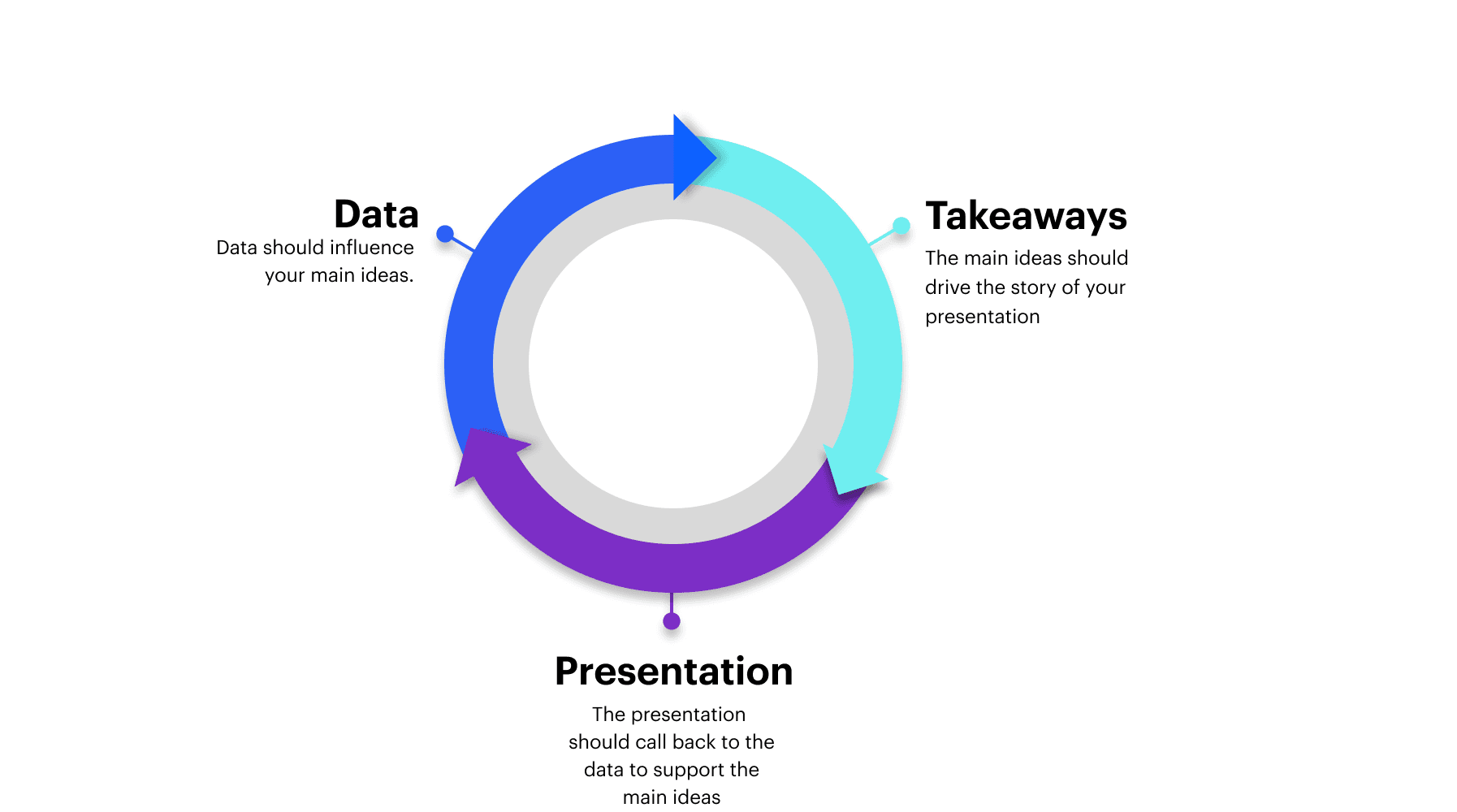
In our busy lives, the art of planning can get lost. We often put ideas on paper or slides, ship them, and hope for the best. But without a structured narrative arc to your data, your audience is unlikely to understand what you have uncovered in your hard work. The more you walk your audience through your journey, the more likely you are to achieve your desired outcome. This is where crafting a story is crucial to your communication. Below are a couple few narrative arcs that tell a compelling story.
Exposition to Conclusion: Similar to a classic work of fiction, you can use the concept of rising & falling action. This approach is suitable for a high-level overview, a new stakeholder, or a team deep dive. Since most of what you’ll be presenting will be a mix of persuasive and informational, it's essential to build out a story arc for your conversations.
Work Backward: Another option could be to tell the audience what to expect at the front, reaffirm that idea throughout, and then build out action items to support that conclusion. This approach is suitable for direct stakeholders or those who want to get in the weeds. This approach is also helpful to get buy-in early and hammer home your point.
Minimize cognitive load on slides
Cognitive load relates to the amount of information that working memory can hold at one time. Understanding this human phenomenon is critical to ensure your audience can remember, act on, and communicate your message.
That’s when the anatomy of a slide comes into play. Pay attention to the amount of white space and how you use the real estate.
Does it flow in order (left to right, top to bottom)?
Is it visually digestible?
Remember that every time you add a new item to your presentation, you ask your audience to use brain power, so be picky with what you include!
Visualize data in the right format
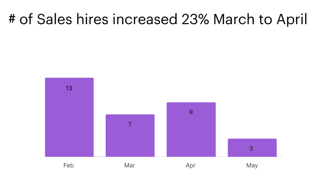
When it comes to presenting data, not all charts are created equal. Take the example below. You’re meeting with your Sales leader and want to give the month-over-month hires to showcase the growth in hires from March to April. Both charts show the same information, yet in the first chart, the consequential data point – 23% increase in hires – gets lost in the unnecessary details to the Sales leader.
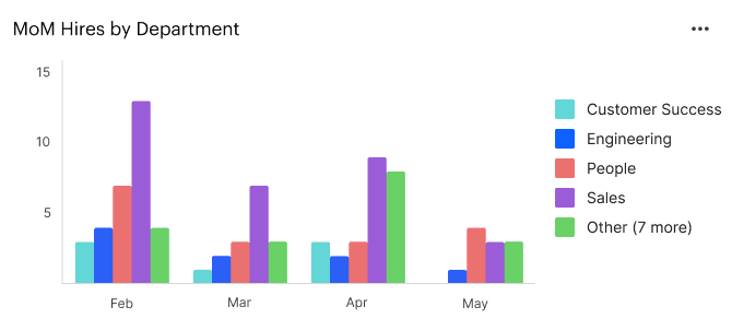
VS
To drive your point across, you might want to consider these guidelines:
Use the slide title to drive your takeaway home as opposed to a data description
Focus on the key insights and avoid irrelevant data that will drown your message
Chart lines and axis titles that don’t help tell your story; use data labels instead.
Use the right chart: line charts are best for trends. Bar charts are almost always better than pie charts.
Conclusion
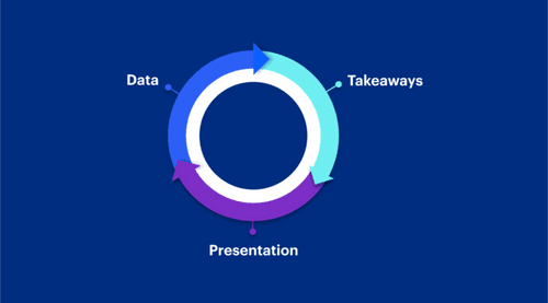
When we accurately present the “why” behind the “what,” we get closer to the desired outcome. In summary, storytelling with data succeeds when you:
Gather your data in the appropriate context
Build a narrative that is best suited to your audience
Consider cognitive load
Visualize in the proper formats
Want to go deeper here? Check out Cole Knaflic’s book “Storytelling with Data.”
Want to join a roundtable discussion with Amy to pick her brain on what more you could be doing to better storytelling with data? Register here!
Share
Related posts

November 7, 2025
Flat teams, growing demands: What our 2025 recruiting survey reveals

October 24, 2025
How to build an effective recruiting capacity plan

August 26, 2025
Why Gem's Workday ATS integration is different and better
Your resource for all-things recruiting
Looking for the latest data, insights, and best practices? Welcome to the Gem blog. We've got you covered.