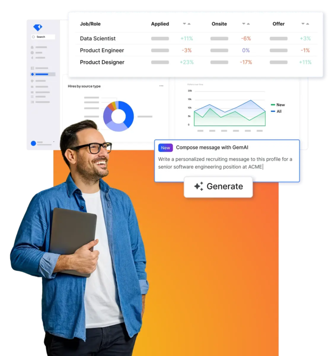


In the modern recruiting function, data drives everything we do and every decision we make. It shows us what recruiting strategies are working, which ones aren’t, where to add resources, and where to pull them back. Building a robust hiring dashboard will give you and your team insights and visibility into every facet of your recruiting funnel and allow you to optimize and enhance your strategies to meet your hiring goals. In this fourth installment of our Ultimate Recruiting Operations Dashboard series, we discuss the “pipeline composition” dashboard. We’ll show you how to tailor your hiring dashboard, talk through the recruiting metrics you should be tracking and why; and finally, we’ll give you some templates you can use today to build the perfect hiring dashboard for your needs.
If you’d like to read the other articles in our Ultimate Guide to Hiring Dashboards series check out the links below:
Disclaimer: The metrics and dashboards shown below are all based on Gem’s platform. If you’re not a Gem user (yet!), we still recommend you take a look at these metrics and track them as best you can.
The pipeline composition dashboard
Hiring is a team sport; and many different stakeholders can play a role in building a candidate pipeline, which makes it all the more important to share as much information as possible among all your hiring teams. This dashboard takes a granular look at the nuances within your existing hiring funnel to assess your talent pool, identify areas that may need improvement, and ultimately build a more fair, equitable, and high-quality pipeline. You can also use these metrics to drive business reviews with your hiring managers and business partners. In addition, looking at the composition of your hiring pipeline allows you and your hiring team to create a plan moving forward to increase diversity and equity on the team and truly partner in the recruiting process.
Key metrics to include in your pipeline composition dashboard:
End of quarter gender breakdown
Applications by gender/race/ethnicity
Offers by gender/race/ethnicity
Offer accepts by gender/race/ethnicity
Applications by source
Offers by source
Offer accepts by source
Hires by location and gender
Here’s what your pipeline composition dashboard may look like in Gem:
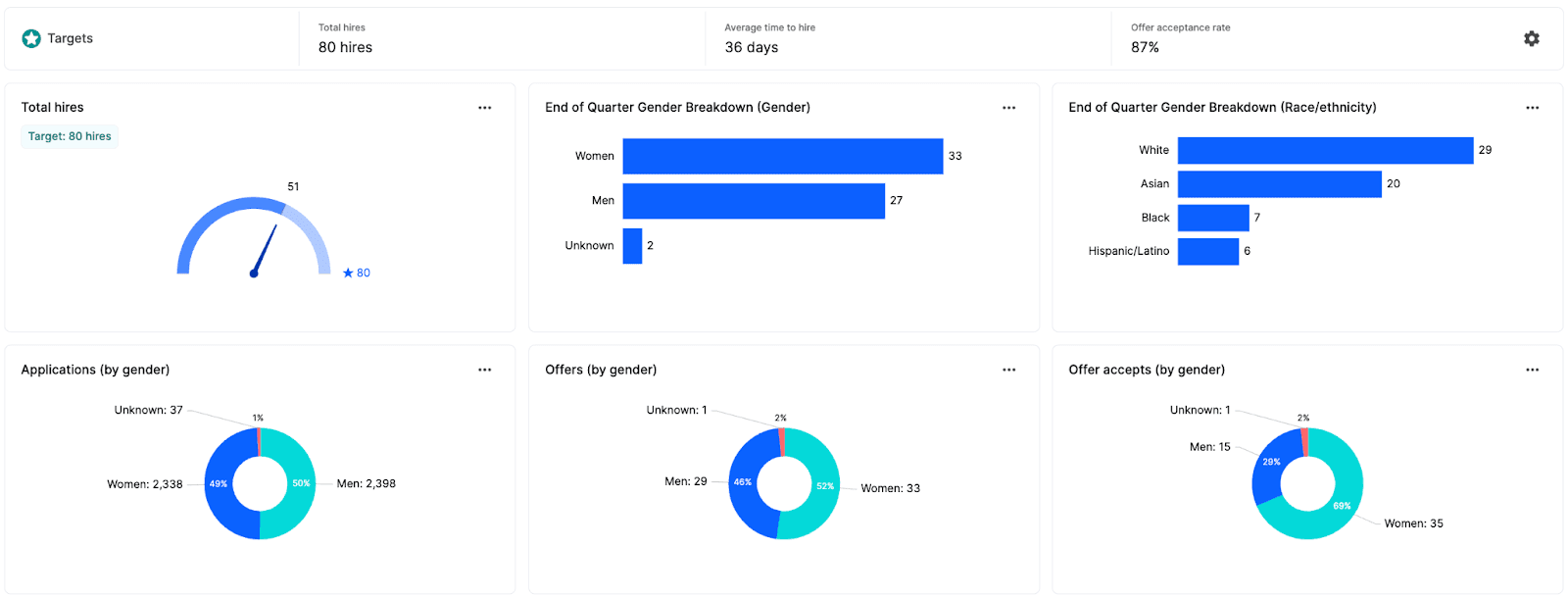


End of quarter gender breakdown
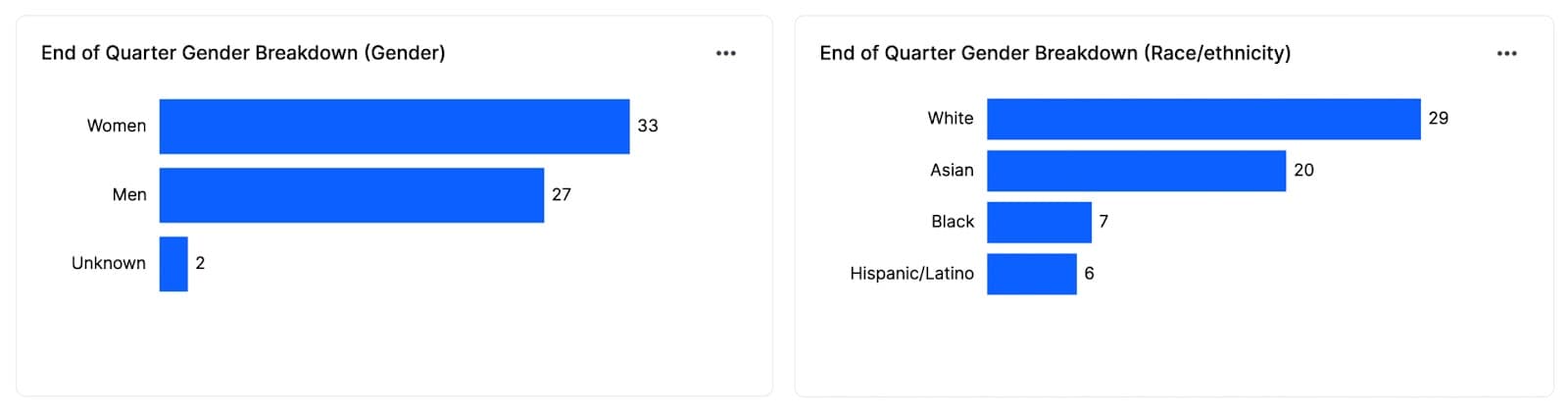
We all want to build more diverse teams. However, diversity goals will look very different based on the role and functional team of the role you’re hiring for. Analyzing the gender and race/ethnic breakdown of your hires can help steer your top-of-funnel efforts in the right direction. You can also present this data to hiring managers, especially when coupled with demographic data from the existing team to determine how they go about building candidate slates in the future.
Applications by gender, race, and ethnicity
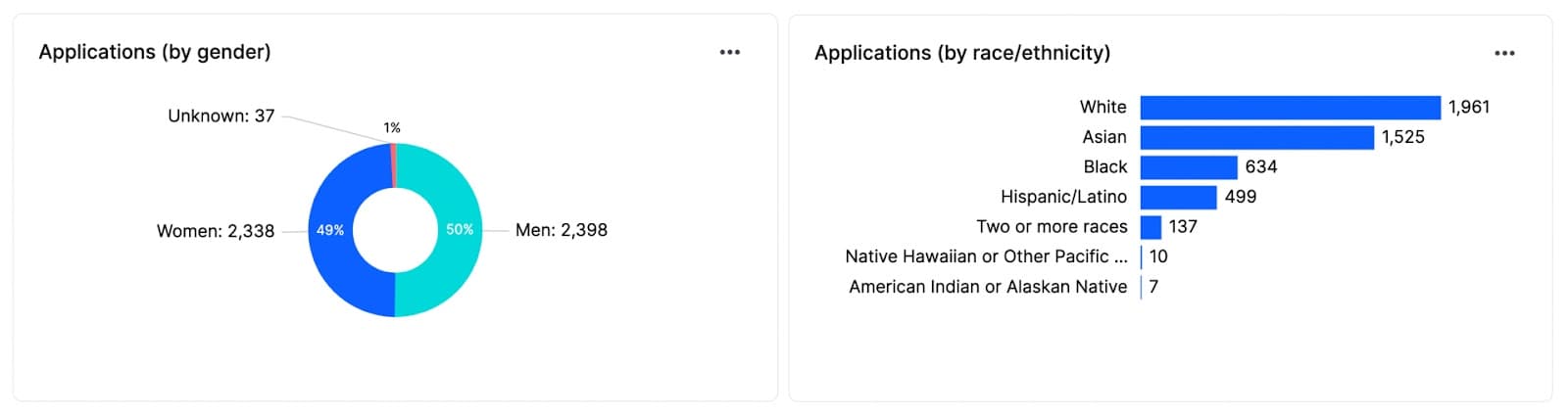
Adding applications by gender, race, and ethnicity to your hiring dashboard will give you a look at the equity at the top of your hiring funnel and allow you to spot any potential biases that may impact your hiring down the line. For instance, if you’re seeing a disproportionate number of white men entering your hiring pipeline (i.e. applying for roles), it’s likely you’ll see the same misrepresentation reflected throughout your hiring funnel (and ultimately, among your new hires). Of course, this metric will largely depend on external factors like the labor market you are hiring in or the type and level of the roles your team is hiring for. However, it may also indicate a problem with how your organization or culture is perceived by potential candidates. If active talent isn't applying to your open roles, the lack of underrepresented talent spotlighted on your careers page, your non-inclusive benefits, etc. may be the culprit. Looking at this metric will allow you to spot any issues at the top of your pipeline, so they don’t become larger systemic problems later on.
Offers by gender, race, and ethnicity
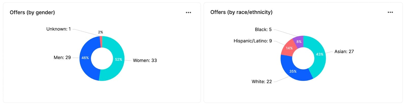
Including offers by gender, race, and ethnicity in your pipeline composition dashboard will give you a glimpse into how candidates from underrepresented groups are moving through your hiring process. Use these metrics alongside your application breakdown to observe any changes in the proportion of men, women, non-binary, and underrepresented talent entering—and completing—the hiring process. For instance, if you notice a large change in proportion (ex: 50% of women enter the interview process, but only 26% make it to the offer), dig deeper into your process to figure out why—could interviewer bias be the culprit? Is there something in the process itself that favors men over women? Or if women are dropping out on their own, what’s the trend in their rejection reasons? Looking at this metric will allow you to identify issues that may be hindering your inclusive hiring goals.
Offer accepts by gender, race, and ethnicity
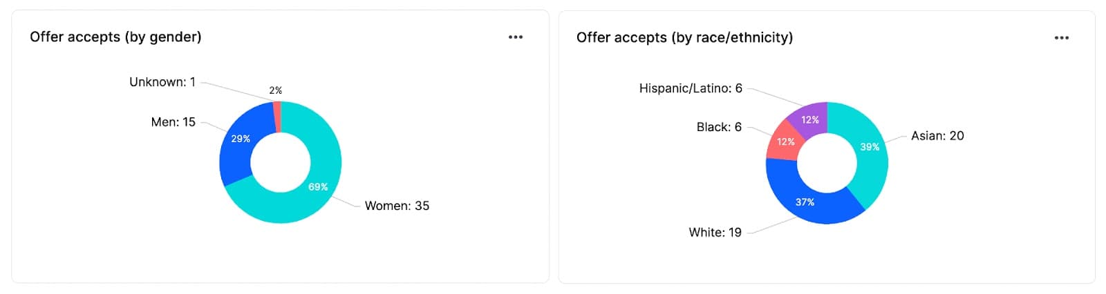
The number of offer accepts by gender, race, and ethnicity looks at the percentage of men, women, non-binary, and diverse talent that have accepted your offers. Adding this metric to your dashboard gives you the final level of granularity needed to show how your efforts are working to build a more inclusive and equitable hiring funnel. For example, if your organization has been working to increase the representation of Hispanic/LatinX representation in its workforce, this metric will show the impact your initiatives have had on employee count.
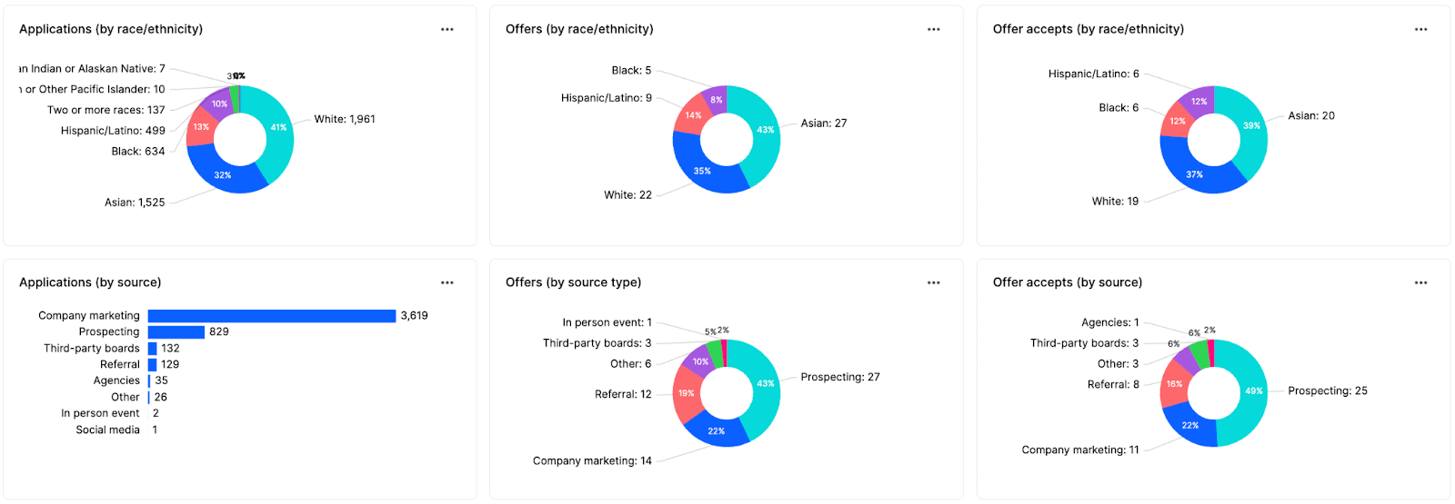
Applications by source
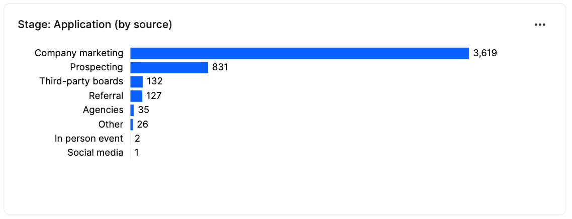
Looking at the number of applications by source gives you a good indication of how your recruitment initiatives are impacting the top line of your hiring funnel. This allows your team to easily tell which sources are bringing in the highest volume of candidates, which sources are lagging behind, and where you might want to consider investing additional resources to meet your hiring goals or pulling resources back from the less effective channels.
Offers by source
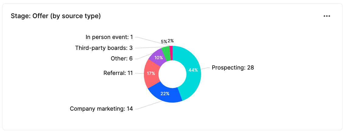
Offers by source is closely related to applications by source, but this metric provides insight into which hiring source is driving the most impact at the bottom of the hiring funnel. You may find that the source that brings in the highest volume of applications is not always the source that results in the most offers. For example (going off our data above), we see that company marketing brought in 3,619 applications, but only yielded 14 offers while prospecting (sourcing) only brought in 831 applications, but resulted in 28 offers. This is an indication that candidate quality is likely much higher from prospecting compared to company marketing—a critical piece of information especially when it comes to budgeting and planning for TA resources.
Offer accepts by source
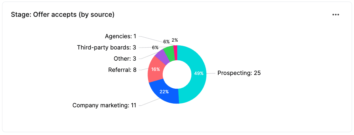
Offer accepts by source is the final metric that has the most impact on your hiring goals. Adding this to your hiring dashboard will show you which sources are driving real results and bringing quality candidates into your organization. The numbers in this metric should (hopefully) be relatively proportional to the numbers shown in the “offers by source” metric. However, if not, you’ll have to do some more digging to find out why. Is your messaging consistent across every channel, from the very top through the bottom of the funnel? For example, if company marketing brings in a high percentage of candidates, but fewer offer-accepts, is it because your marketing is over-promising something, and candidates are disappointed in your hiring process? Or if third-party boards bring in a smaller number of applicants, but more of them pass through, is that suggestive that your job descriptions are lackluster, and more folks would enter your funnel (and accept offers with you) if you spruced them up? These are just a few of the many questions you may dive into, but looking at your offer accepts by source is the first step in the process.
Hires by location and gender
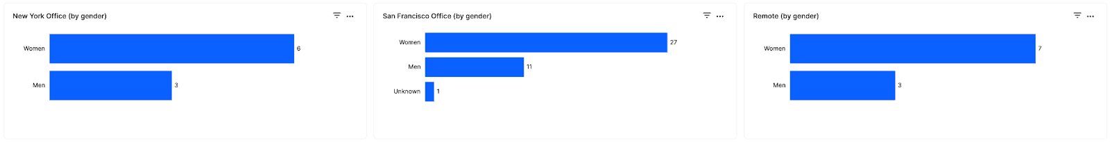
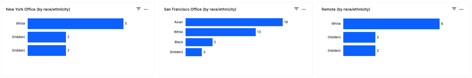
If you’re committed to building a diverse team, breaking down these metrics by location can be helpful in determining if the balance is tipped in certain areas. This would prompt different follow-up questions depending on the results: What did our nurturing playbook look like? What are our conversion rates like through the funnel? Why are fewer women passing through in our London office than in our Dublin office? All of this can be found in Gem to tell a full story of what’s happening in each of your locations. As a RecOps professional, you know the value of good data—it informs nearly every facet of your job and empowers you to make better decisions for your TA team. Creating easy-to-read hiring dashboards is the key to better understanding your recruiting data and getting buy-in from key stakeholders that are critical to your role. Your pipeline composition dashboard will allow you to ensure strong communication and sharing of information with all stakeholders that drive hiring at your org and enable you to build a more fair and equitable candidate pipeline. If you’d like to learn more about how to build your own pipeline composition dashboard, get in touch with us today!
Share
Related posts

November 7, 2025
Flat teams, growing demands: What our 2025 recruiting survey reveals

October 24, 2025
How to build an effective recruiting capacity plan

August 26, 2025
Why Gem's Workday ATS integration is different and better
Your resource for all-things recruiting
Looking for the latest data, insights, and best practices? Welcome to the Gem blog. We've got you covered.